Buying Guide
Choosing the right artists drawing lettering aids starts with matching the tool to the scale and surface of your project. A stencil that works beautifully in a pocket journal may be too small for a wooden porch sign, while a large wall template can overwhelm a greeting card. Before adding anything to your cart, consider how the size, material, and feature set of each aid will interact with your preferred medium.
Sizing and Capacity
Letter height is the first filter to apply. For fine print, planner headers, or architectural notes, look for templates that offer characters under one inch. These smaller aids often come as graduated sets, letting you shift from captions to subheadings without switching kits. If your goal is signage, murals, or fabric banners, move up to two-inch, three-inch, or even four-inch stencils. Larger characters are easier to read from a distance and tend to pair well with broader markers or paint brushes. Keep in mind that bigger stencils require more storage space and a flatter work surface to prevent gaps under the edges.
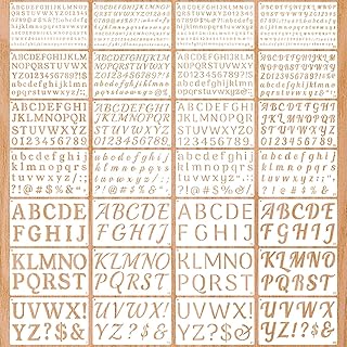
Capacity also matters in terms of piece count. A minimal five-piece set can cover the entire alphabet in a compact footprint, which is ideal for travel or small desks. On the other hand, a forty-piece kit may include symbols, punctuation, and decorative frames that speed up complex layouts. Decide whether you value portability or completeness, because that tradeoff will narrow your options quickly.
Feature Tradeoffs
Interlocking stencils are a major convenience for anyone spelling out names or long phrases. The small connectors keep letters on a straight baseline and maintain consistent kerning without a separate ruler. However, interlocking designs sometimes sacrifice individual letter stability, so you may need to tape the template down on slick surfaces.
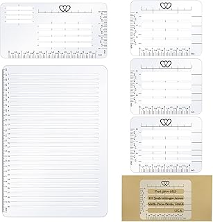
Straight-line guides and addressing rulers serve a different purpose. Instead of cutting out letters, they provide ruled baselines and spacing marks that train your hand for freehand lettering. These aids excel in calligraphy practice and formal envelope work where a purely mechanical stencil look feels too rigid. If you alternate between structured stencils and guided freehand, owning one of each type will cover the widest range of styles.
Material thickness is another hidden variable. Thin PET or plastic stencils lie flat against paper and are easy to wash, but they can curl or crack under heavy body weight if you lean on them. Rigid templates, often found in drafting and technical sets, resist flexing and yield cleaner edges on rough wood or canvas, though they add bulk to your kit.
Installation and Setup Considerations
Most lettering aids require no true installation, yet surface prep can make or break your results. Always secure the stencil with low-tack tape or repositionable adhesive spray when working on vertical surfaces such as walls or chalkboards. On fabric, a non-slip mat underneath prevents the textile from shifting while you trace. If you plan to use aerosol paint, choose stencils with raised bridges or thick borders that reduce bleed-under.
For envelope addressing guides and straight-line rulers, alignment is the critical setup step. Mark your paper with light pencil ticks at the margins, then butt the ruler against those ticks before drawing each baseline. Working in a well-lit area also helps you spot gaps between the template and the substrate before ink touches the surface.
Maintenance and Longevity
Reusable plastic stencils last for years if cleaned promptly. Acrylic paint and ink should be rinsed off with warm water before they dry in the crevices. Avoid abrasive scrubbers that can fog the surface or widen the cutouts by microscopic amounts. Store templates flat in a folder or hang them on hooks to prevent warping; even slight bowing can lift edges and break the seal against your work.
Technical guides with moving parts, such as rotating lettering aids, benefit from an occasional drop of light machine oil on the pivot point. Keep them away from direct sunlight and heat sources so the plastic does not become brittle over time.
Reliability Signals and How to Compare Reviews
When evaluating artists drawing lettering aids, prioritize recent reviews that mention the specific surface you intend to use. A stencil that performs well on smooth cardstock may struggle on rough barn wood. Look for recurring themes around edge sharpness, whether the letters release cleanly from the template, and how well the material survives repeated cleaning.
Review count matters, but context matters more. A product with several thousand ratings and a 4.5-star average usually indicates broad compatibility and durable manufacturing. Newer listings with fewer reviews can still be excellent, especially if the feedback is detailed and includes photos of finished projects. Be cautious of patterns that mention flimsy plastic, incomplete character sets, or cutouts that snag brushes; these defects rarely improve with time.
Final Recommendation
If you need one kit that handles multiple project scales, the multi-size stencil set at the top of our list offers the greatest flexibility without forcing you to buy separate packs. For daily journalers and bullet-planner enthusiasts, a compact thirty-six-piece stencil collection with both letters and icons will cover most layout needs while fitting inside a standard notebook pocket. Sign makers and home decorators should gravitate toward larger-format templates with thicker plastic bodies that can survive paint and outdoor conditions.
Those focused on calligraphy and hand-lettering improvement will get more mileage from a straight-line guide or a precision drafting template than from traditional alphabet stencils alone. Finally, if you are equipping a classroom or shared studio, choose a crowd-favorite set with extensive review history; proven durability under heavy use saves money and frustration over the semester. Match the aid to your scale, medium, and skill goals, and your lettering will stay crisp from the first sketch to the final piece.